What’s The Key Word In Fashion Come Spring 2017?
If you are not yet acquainted with ‘Greenery’ in fashion terms, then you are about to be.
Pantone Colour of the Year is a representational colour selection; a preview of what we see occurring in our global culture that serves as a statement of a mood or an attitude.
The perennial paint purveyor is advocating “a lively and fresh yellow-green shade that evokes feelings of the initial days of spring, when everything comes to life” ~ as the characterising tone of 2017. This was certainly one of the significant themes of the SS17 shows, where all things botanical reigned supreme. Designers like Sies Marjan, Balenciaga, Emilio Pucci, Gucci, Michael Kors, Kenzo, Zac Posen, and Cynthia Rowley created garments in what Pantone calls “nature’s neutral”.
Balenciaga worked the shade into a horticultural-themed jumpsuit, and at Michael Kors, it formed the premise of a ruffled dress with modern accents. Cynthia Rowley worked it into beautiful embroidered silhouettes for a bohemian aesthetic, and Gucci utilised it unapologetically for monochrome structured trousers and coats. Several brands choose a more intense slant on the colour; for instance, Moschino showcased an emerald dress with exaggerated ruffles. A darker, bottle green also appeared in collections for Sonia Rykiel, Balmain, and Rochas.
Consider updating your wardrobe by bringing the freshness of the outdoors inside. 🙂 Leading fashion houses styled their greenery in a variety of ways, wearing it monochrome for additional effect or as a mishmash of dynamic hues for a summery vibe. However you may decide how to wear yours, remember that this is the season to indulge your inner “Green Goddess”!
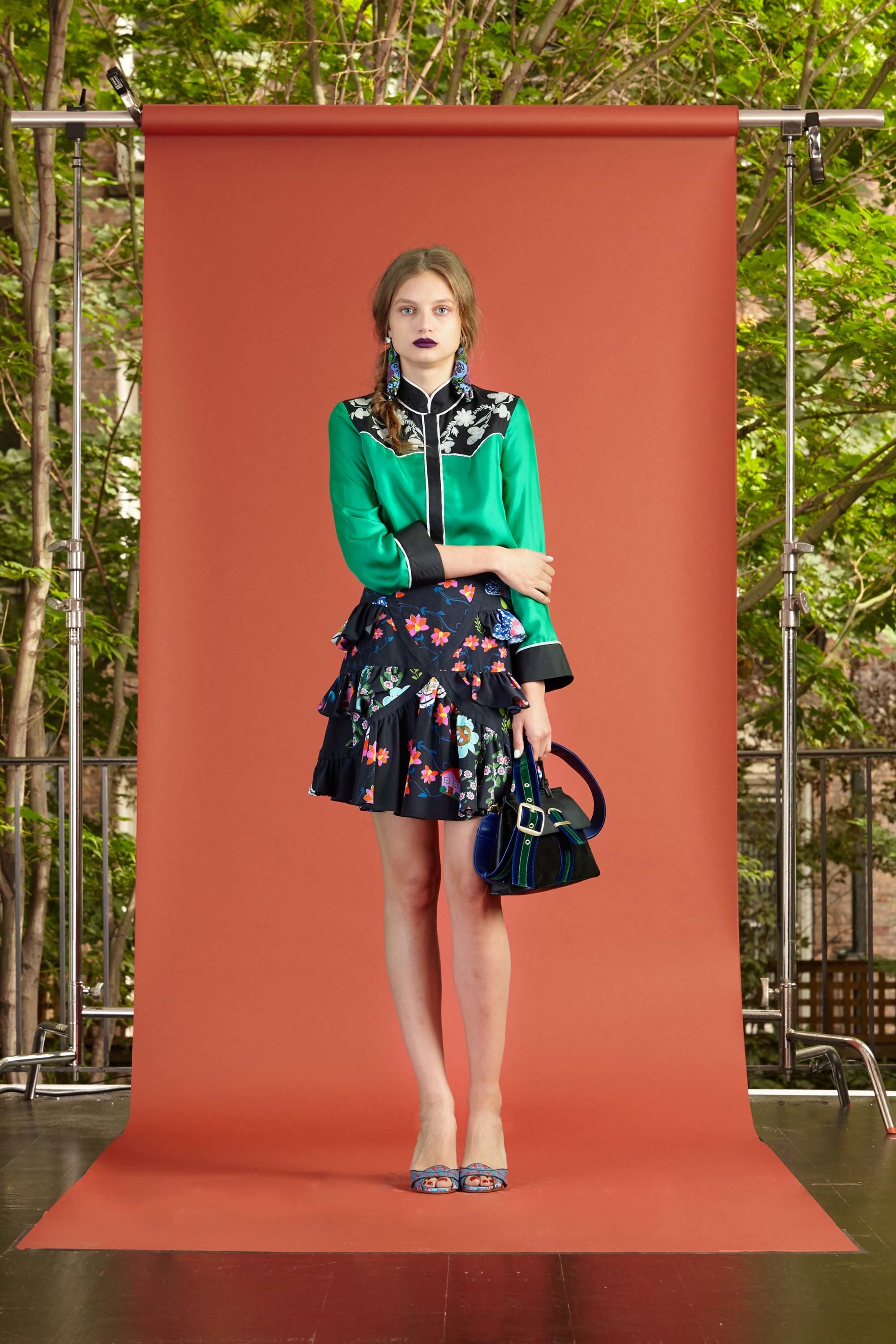
Look 1 – Cynthia Rowley Resort 2017
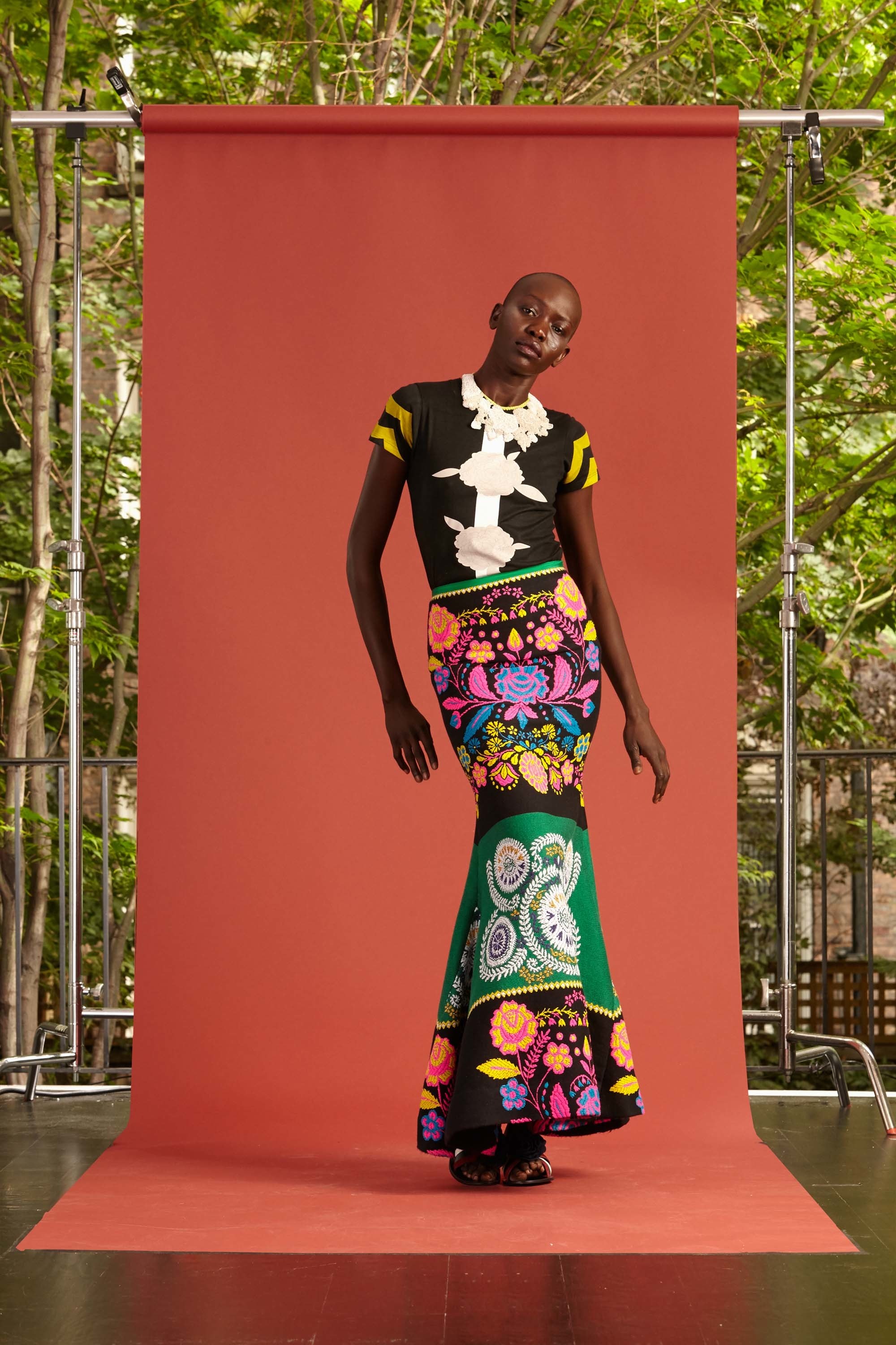
Look 2 – Cynthia Rowley Resort 2017
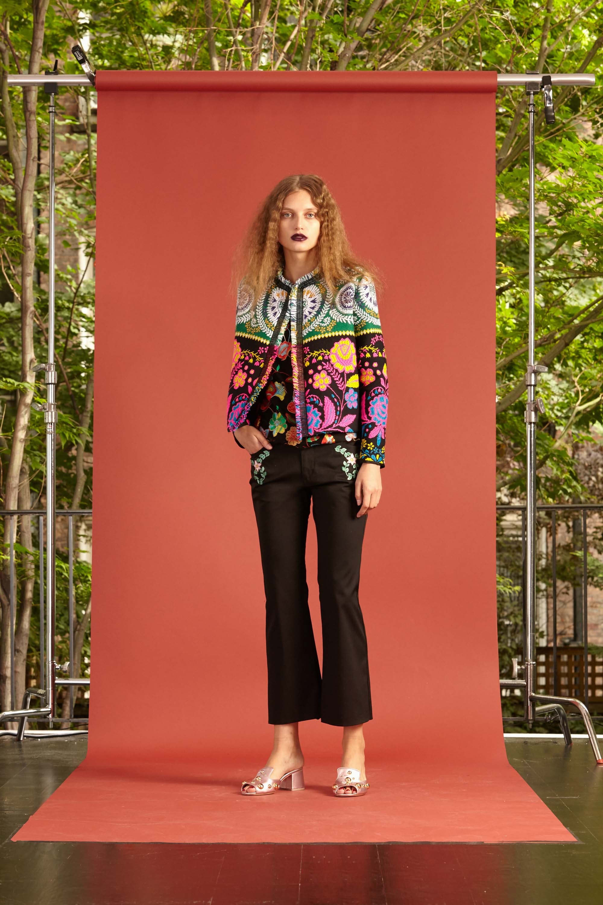
Look 3 – Cynthia Rowley Resort 2017
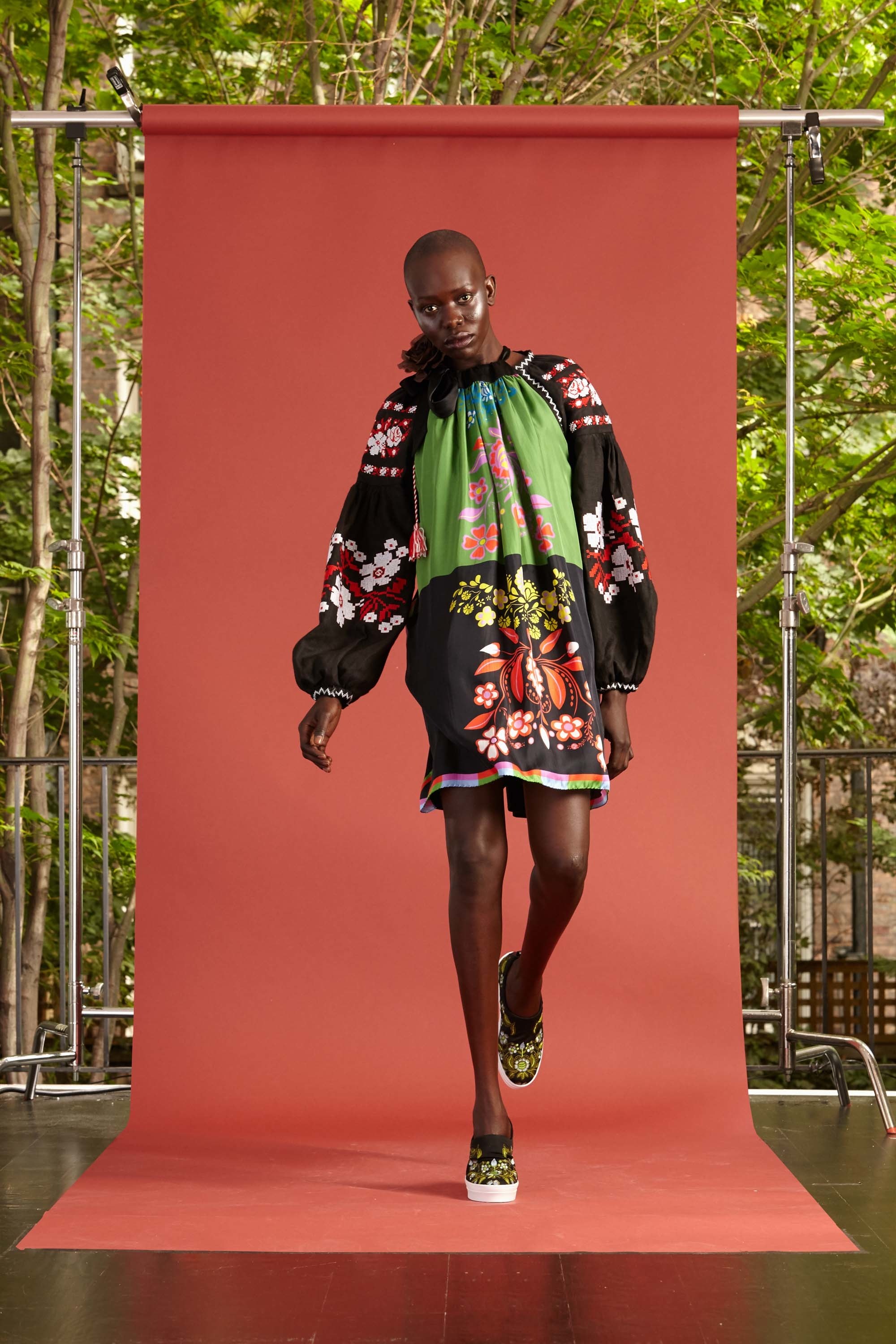
Look 4 – Cynthia Rowley Resort 2017
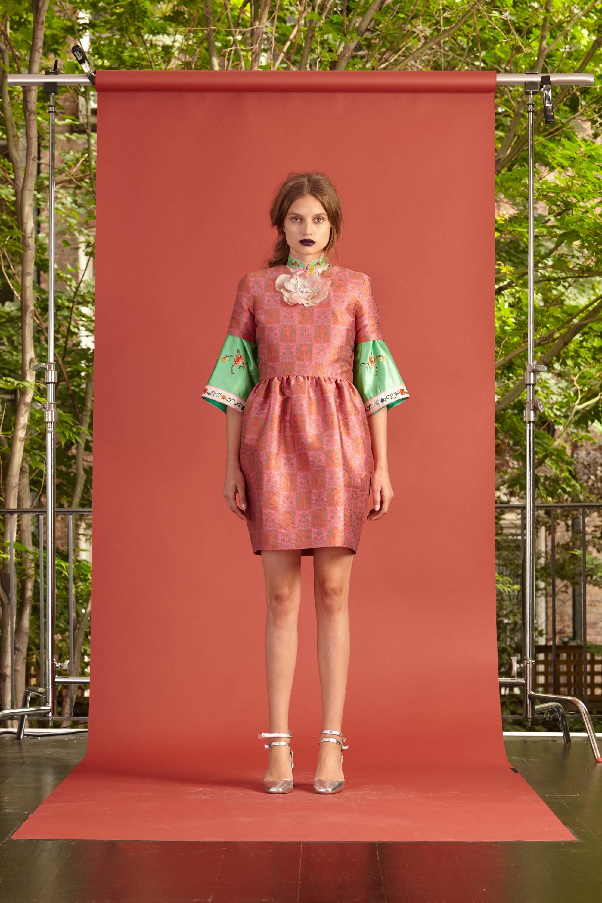
Look 5 – Cynthia Rowley Resort 2017
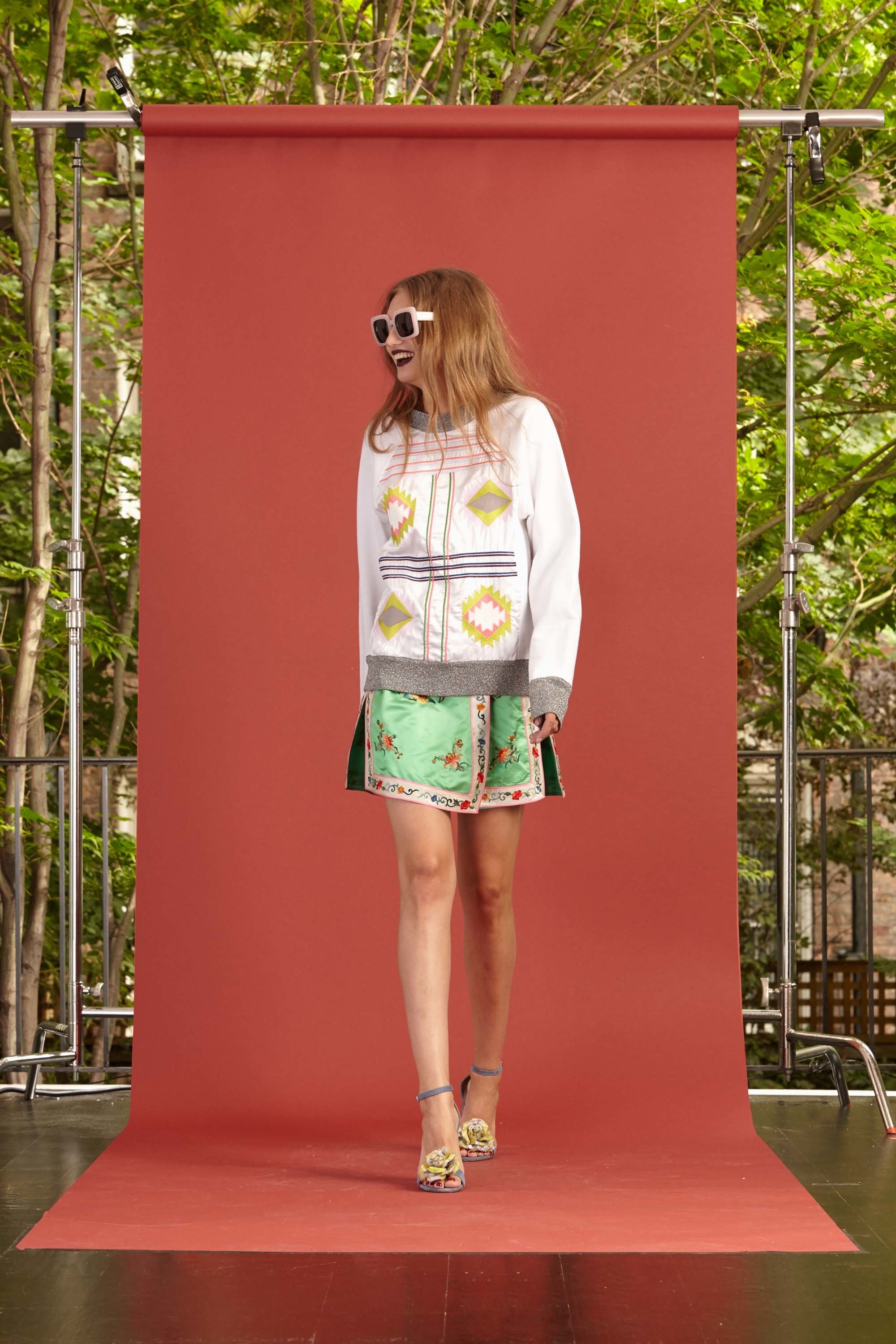
Look 6 – Cynthia Rowley Resort 2017
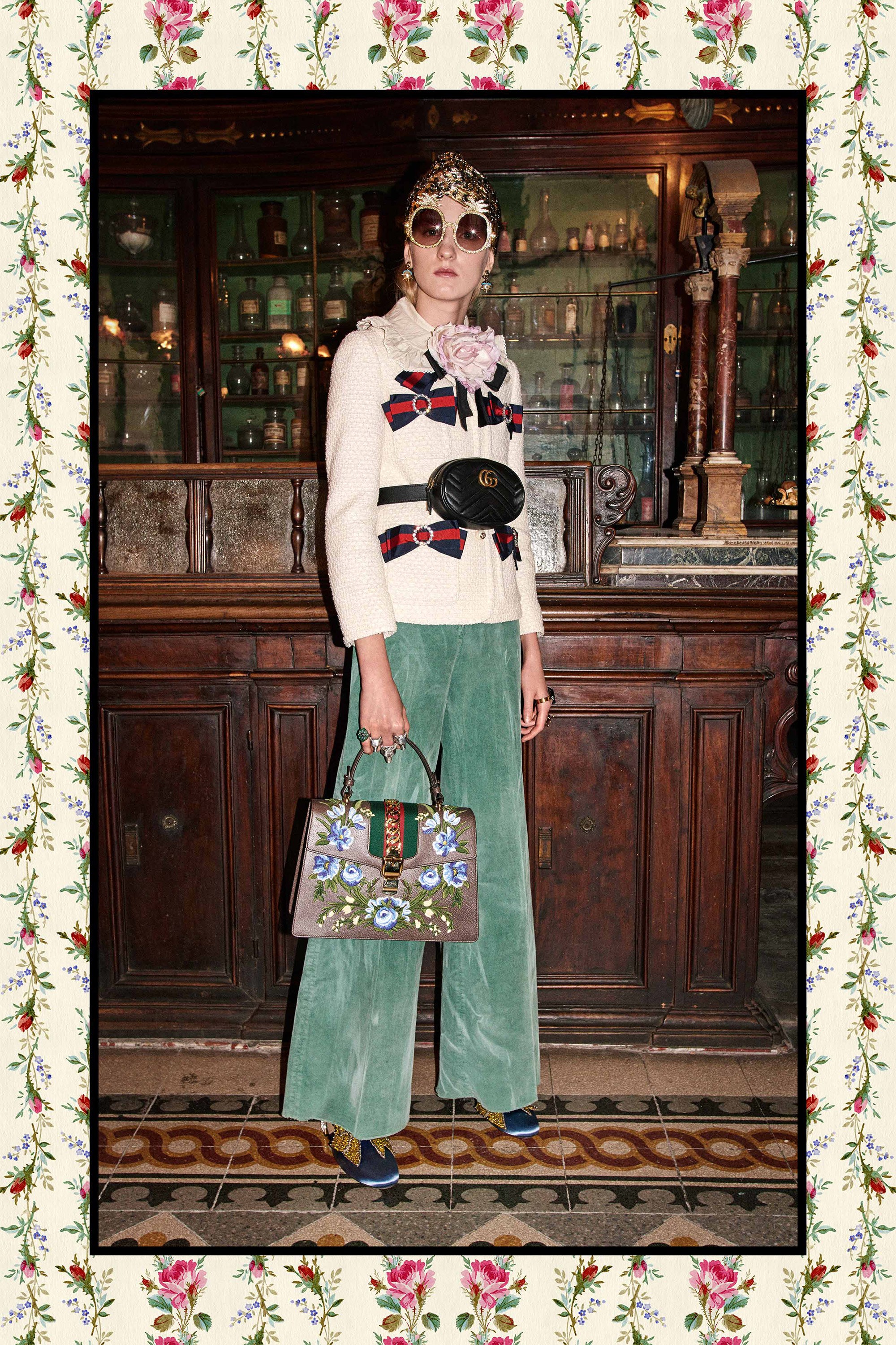
Look 7 – Gucci Pre-fall 2017
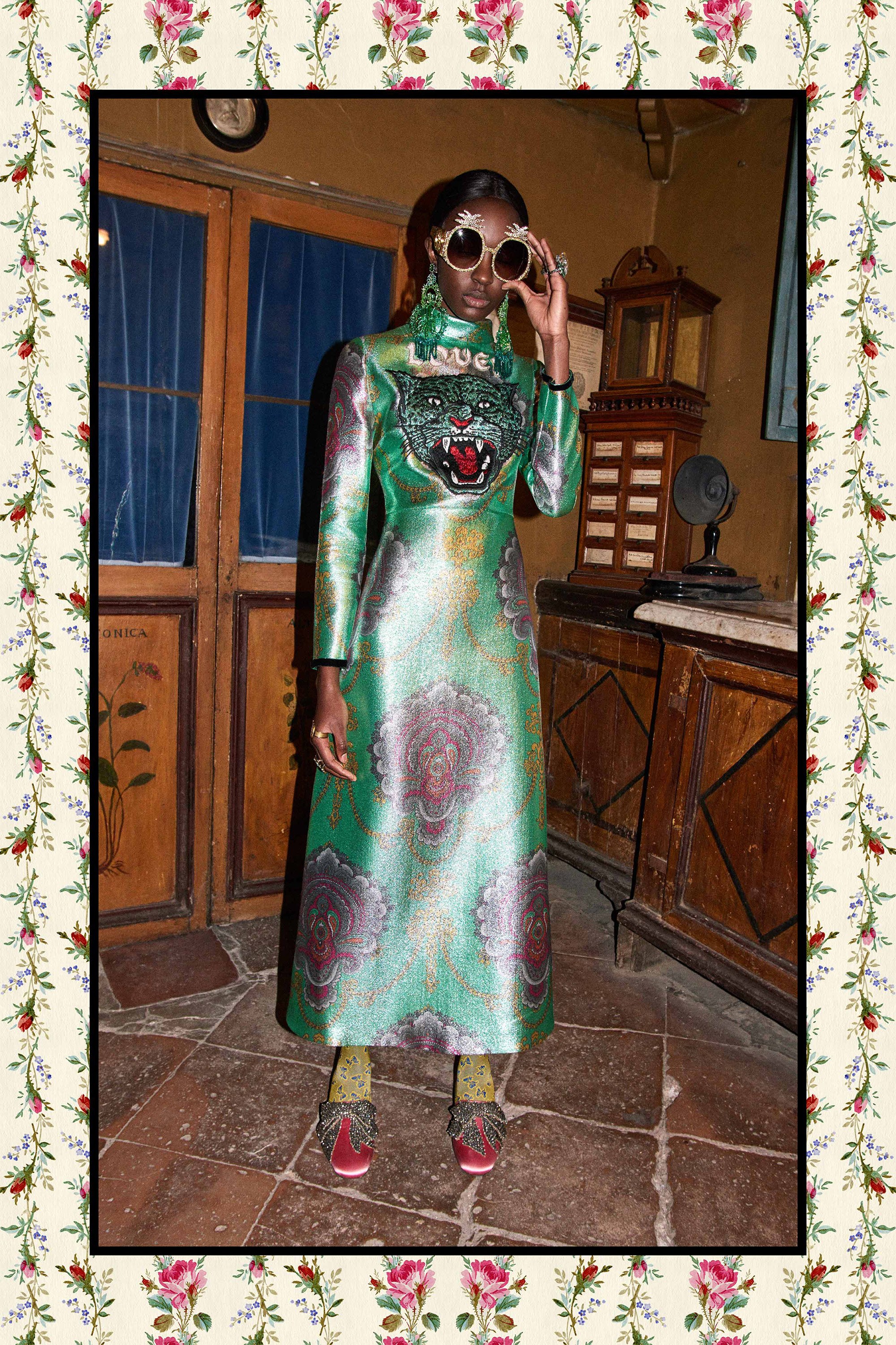
Look 8 – Gucci Pre-fall 2017
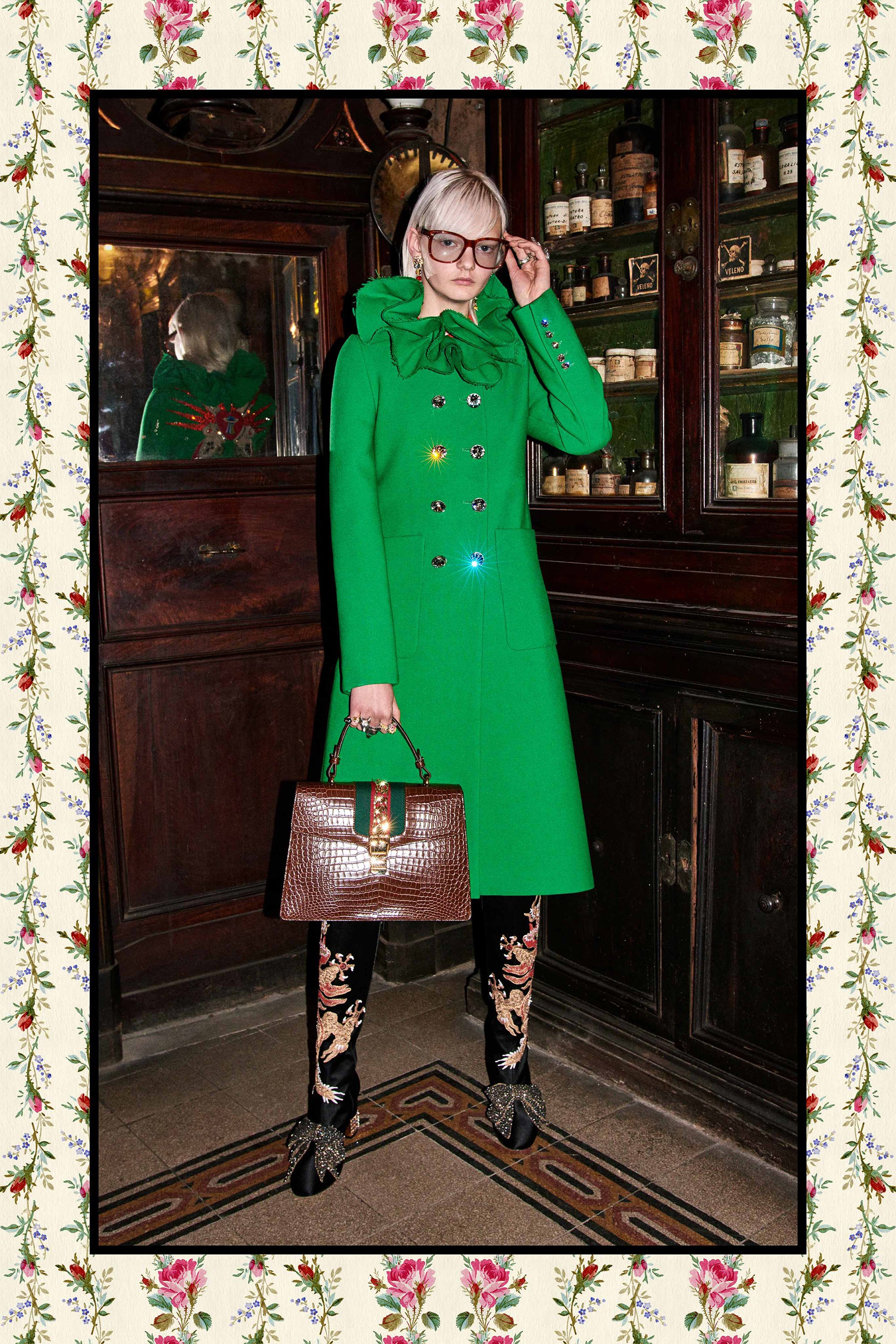
Look 9 – Gucci Pre-fall 2017
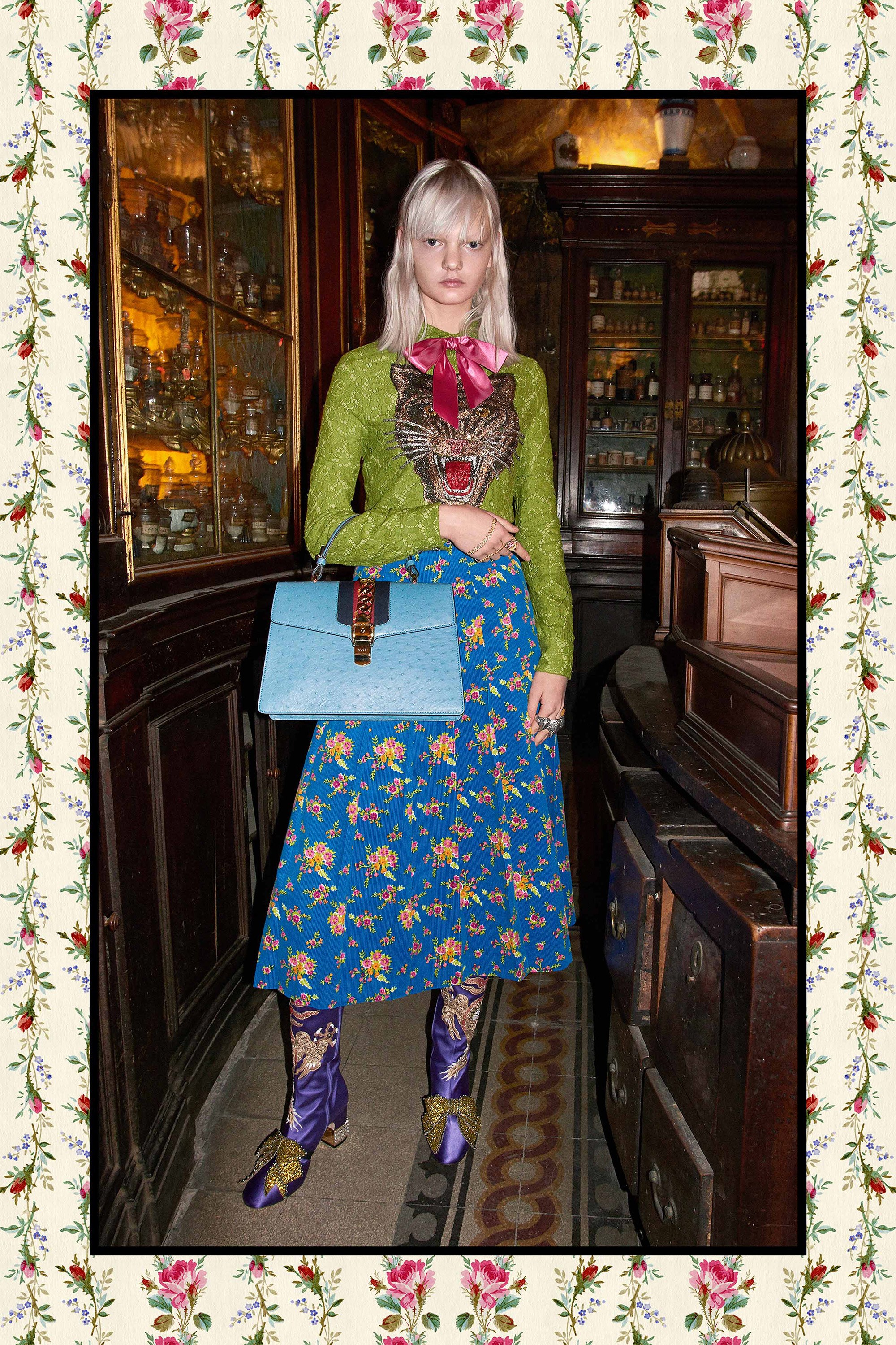
Look 10 – Gucci Pre-fall 2017
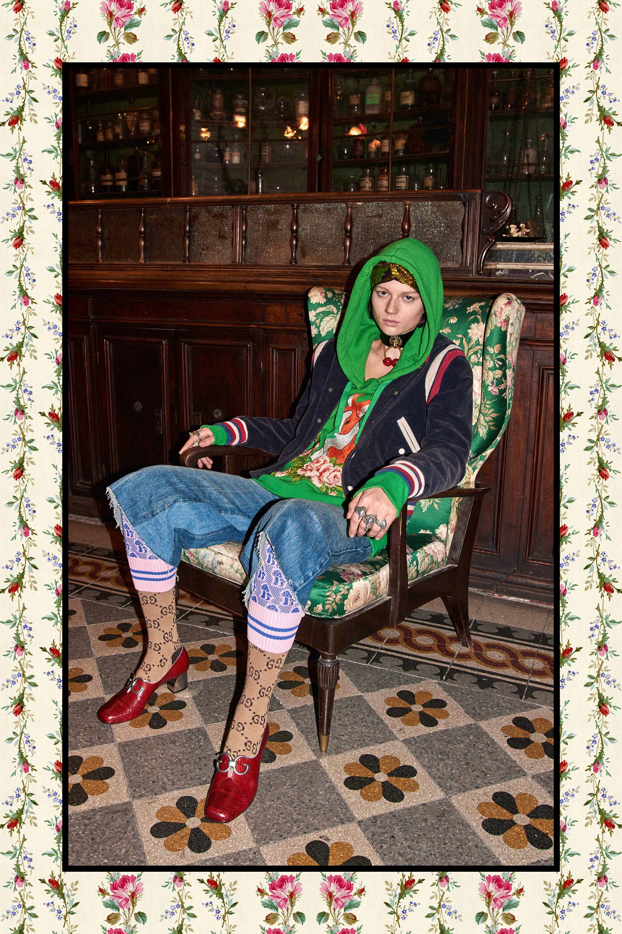
Look 11 – Gucci Pre-fall 2017
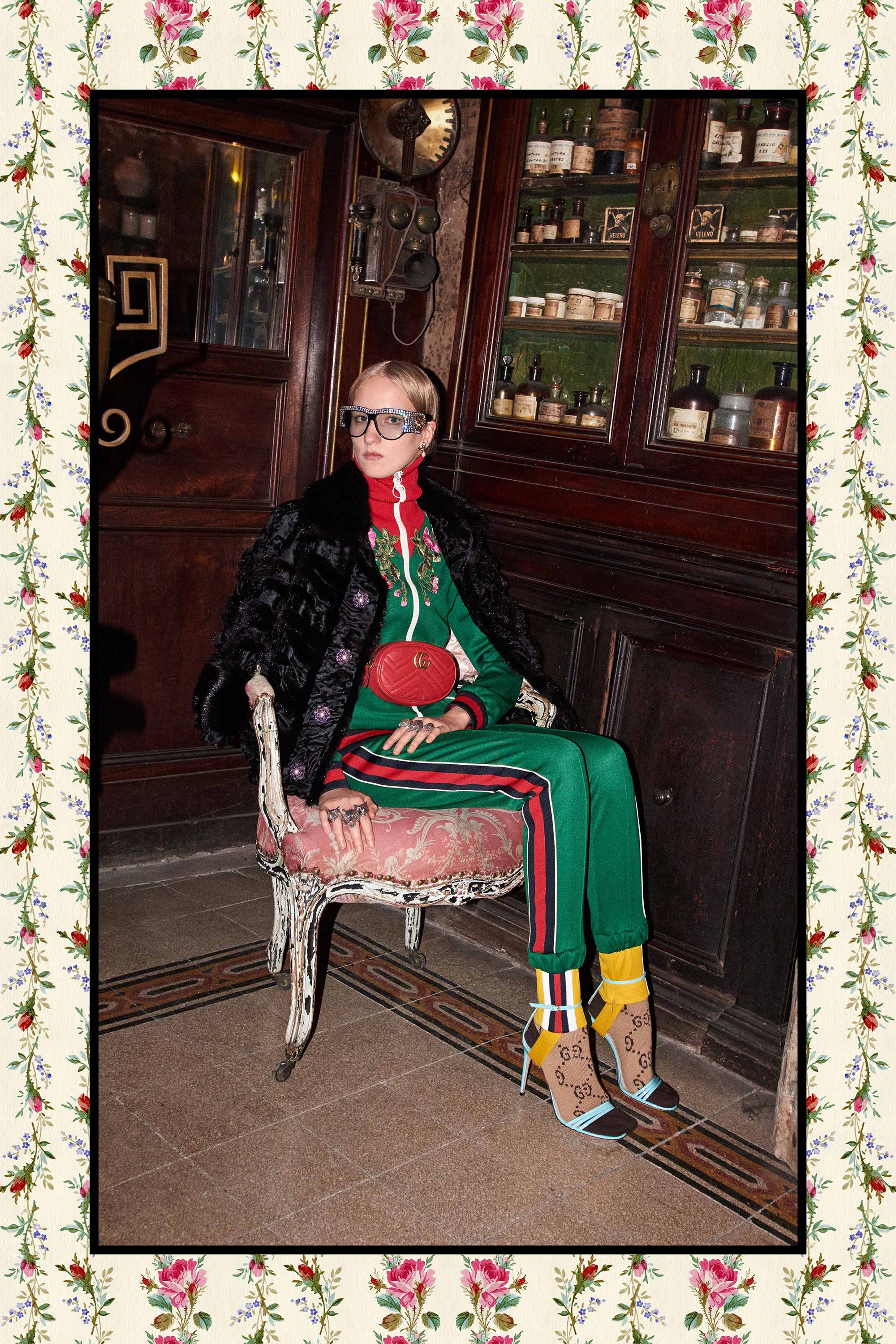
Look 12 – Gucci Pre-fall 2017
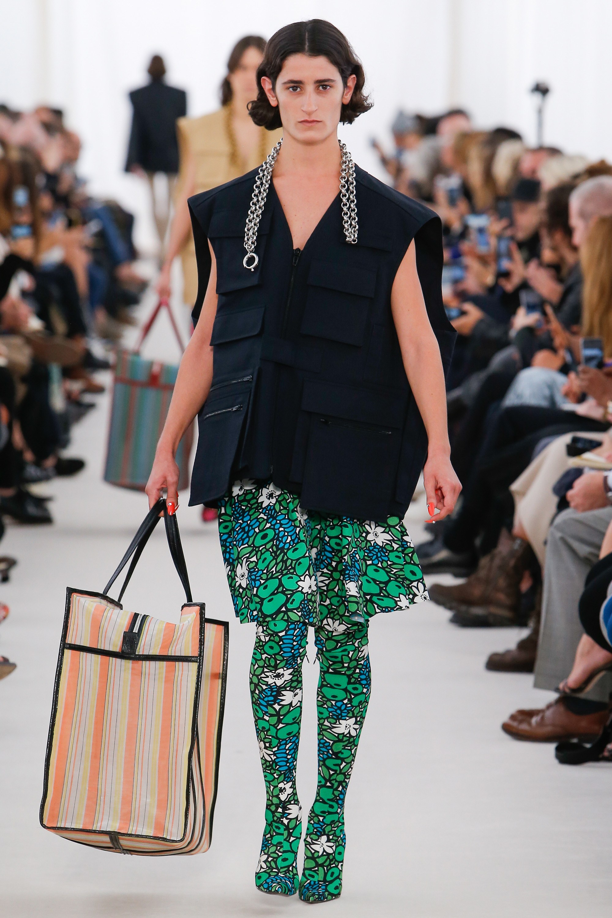
Look 13 – Balenciaga Spring-Summer 2017
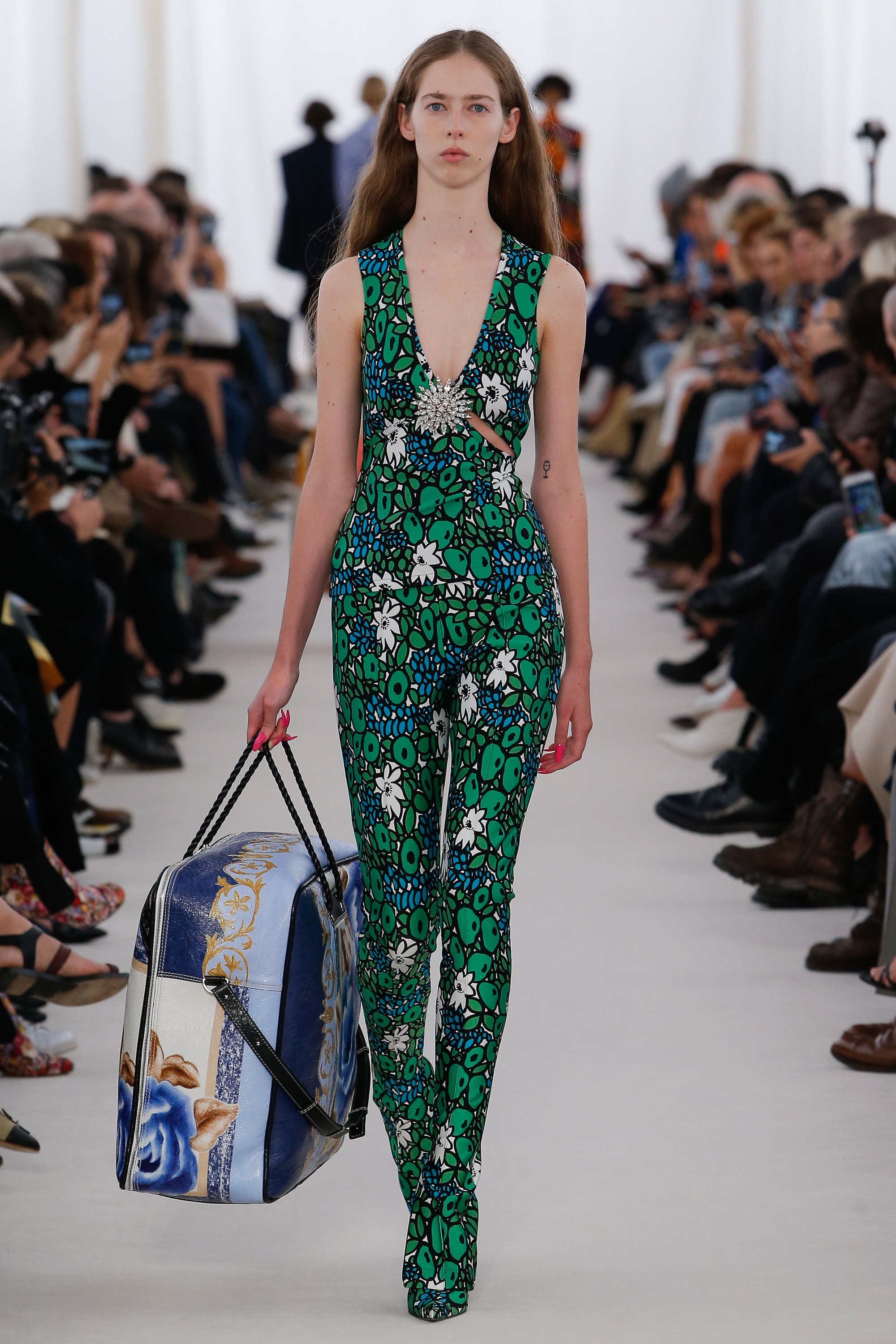
Look 14 – Balenciaga Spring-Summer 2017
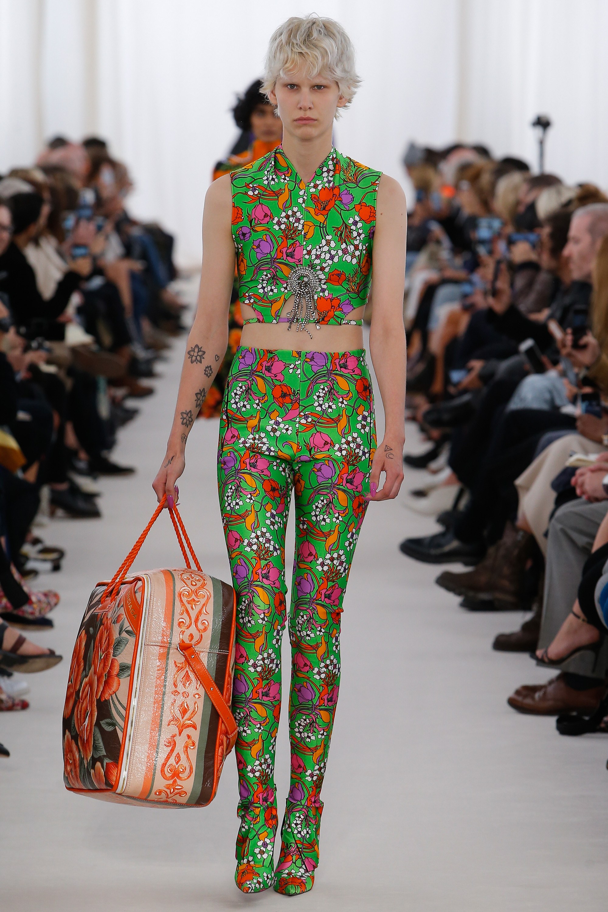
Look 15 – Balenciaga Spring-Summer 2017
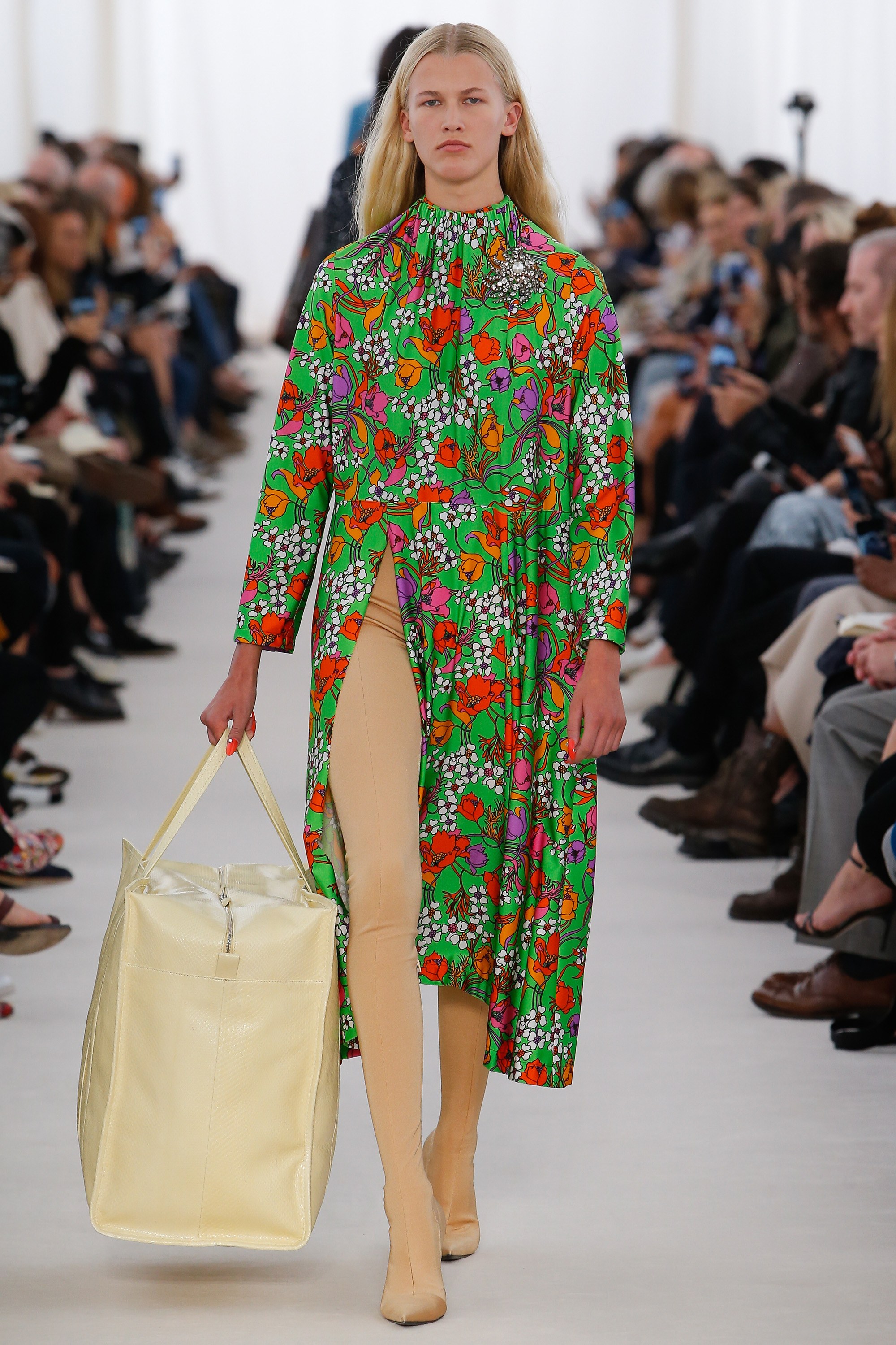
Look 16 – Balenciaga Spring-Summer 2017
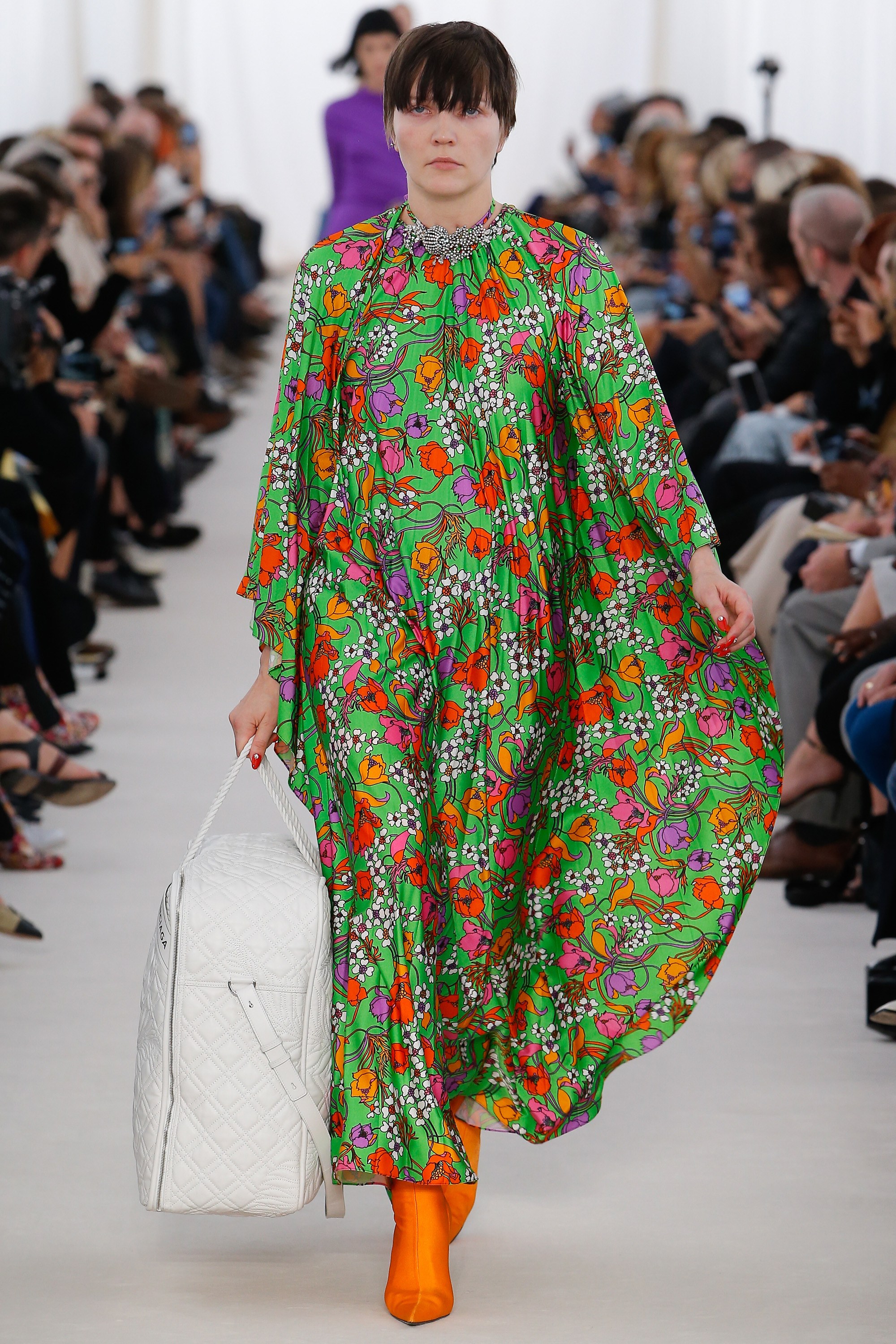
Look 17 – Balenciaga Spring-Summer 2017
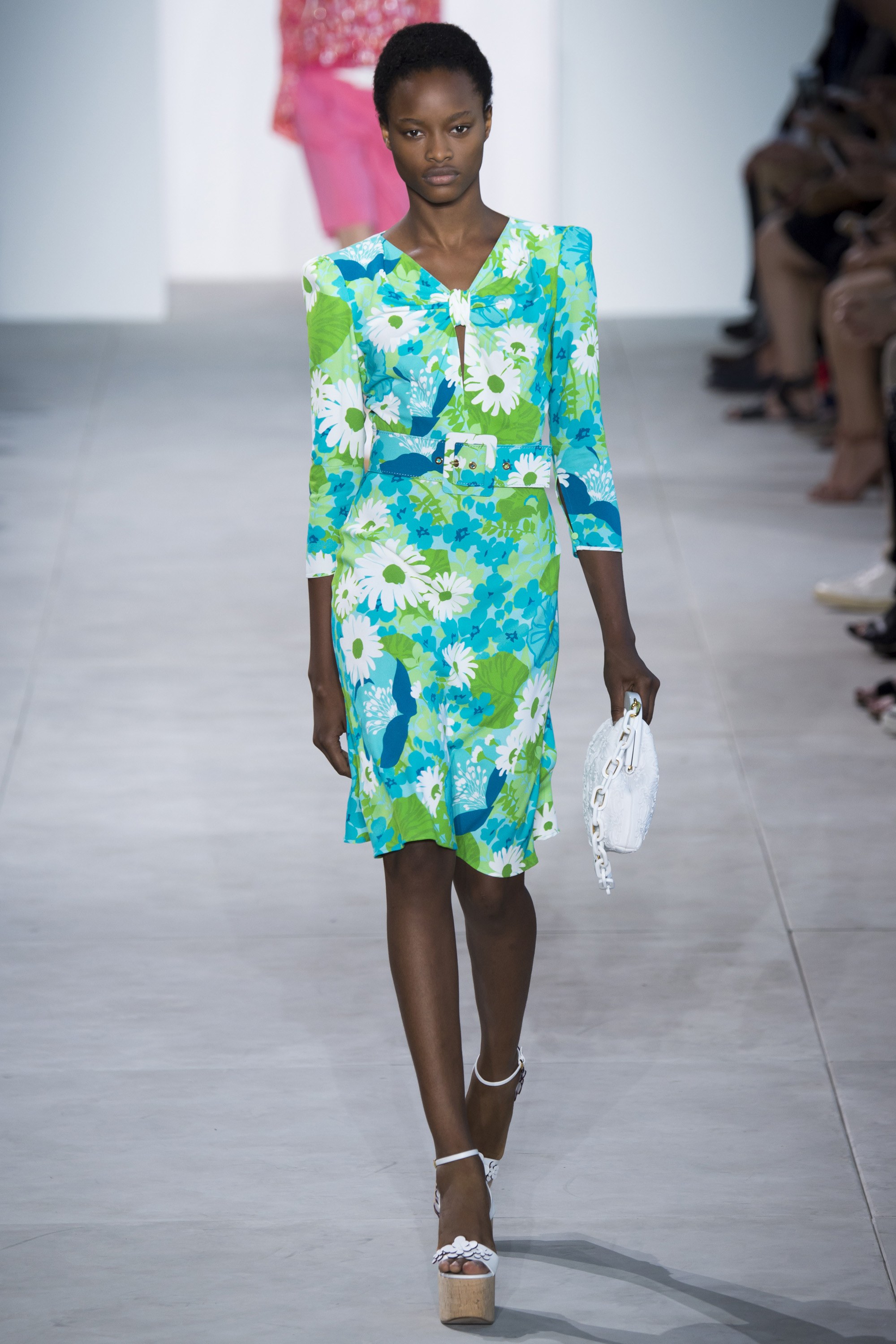
Look 18 – Michael Kors Spring-Summer 2017
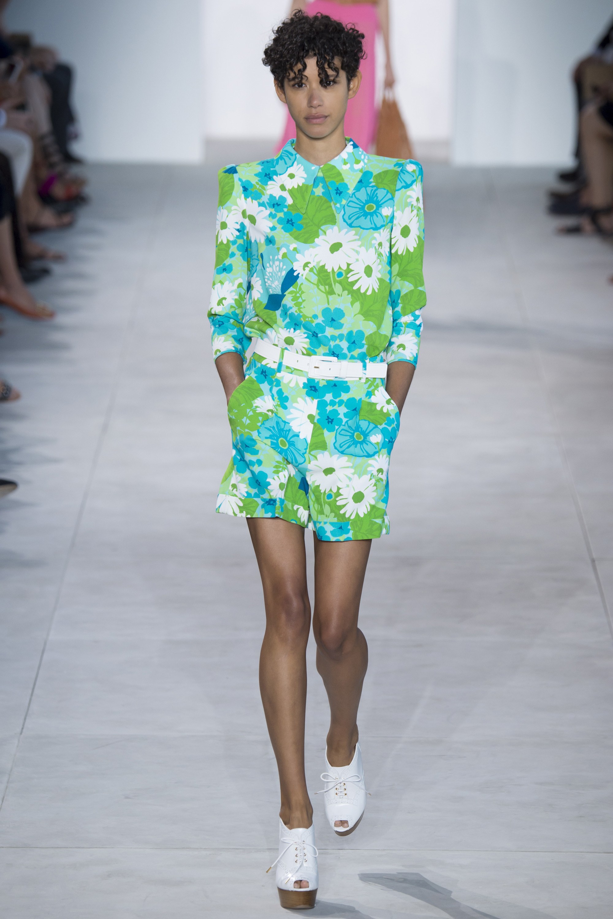
Look 19 – Michael Kors Spring-Summer 2017
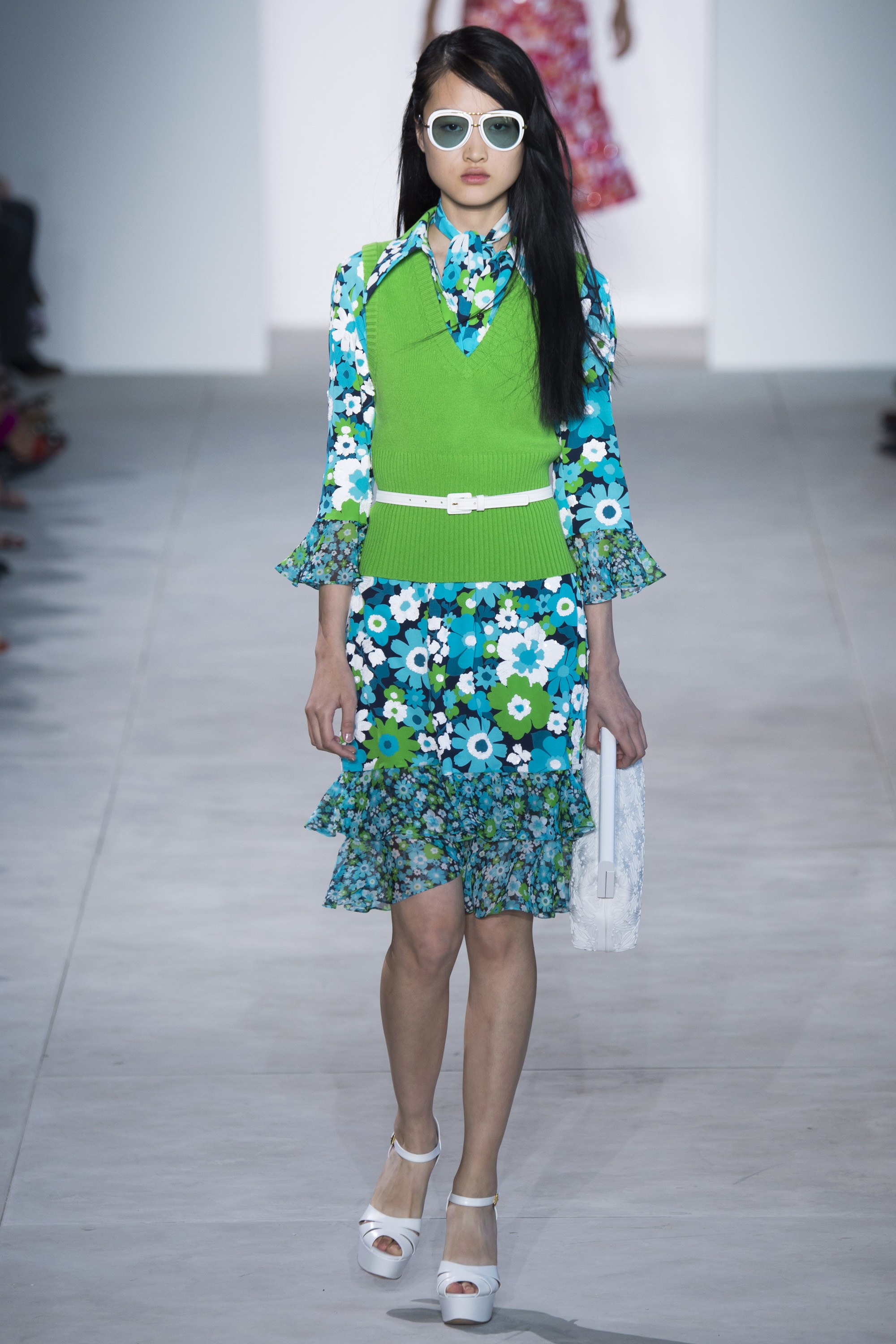
Look 20 – Michael Kors Spring-Summer 2017
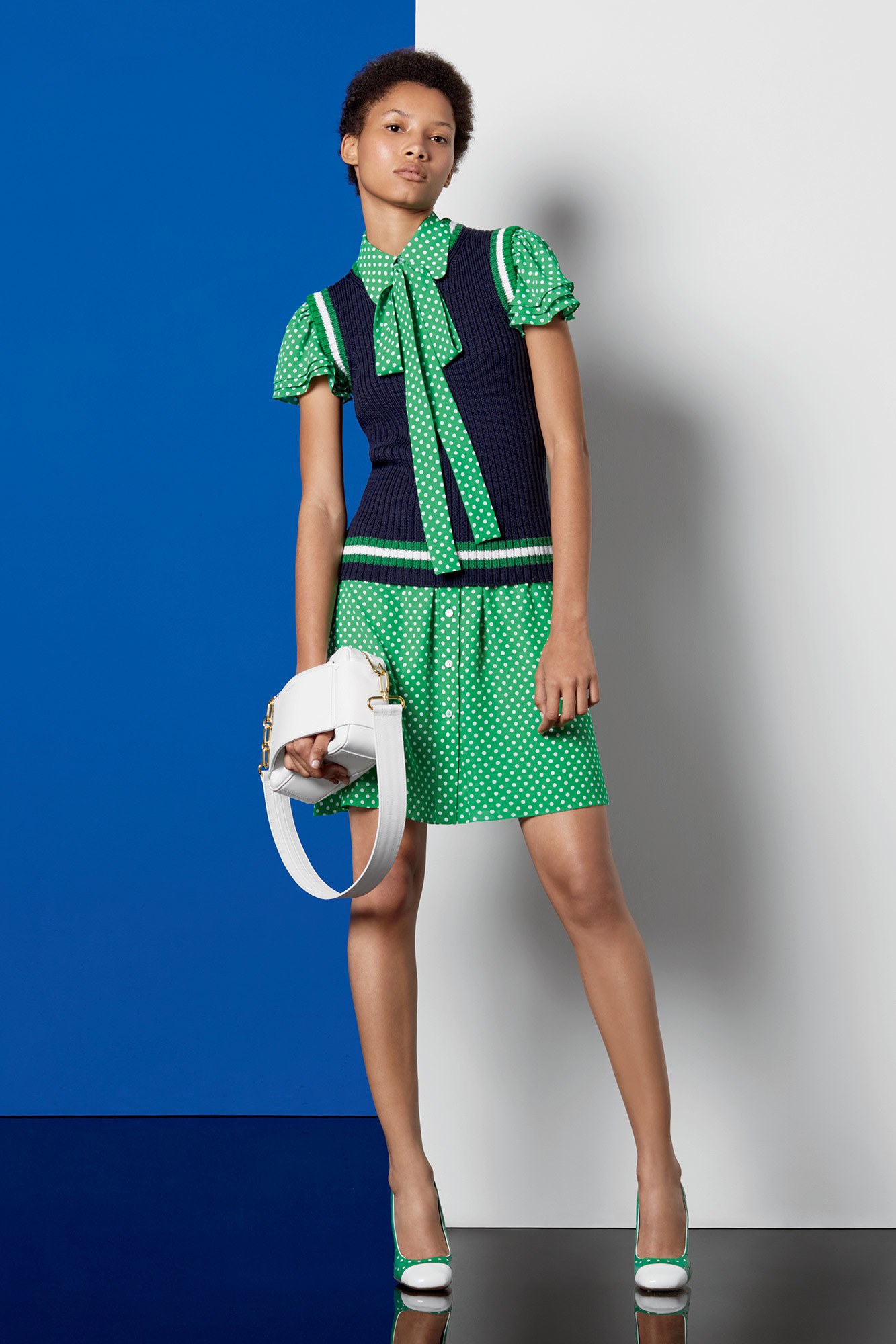
Look 21 – Michael Kors Resort 2017
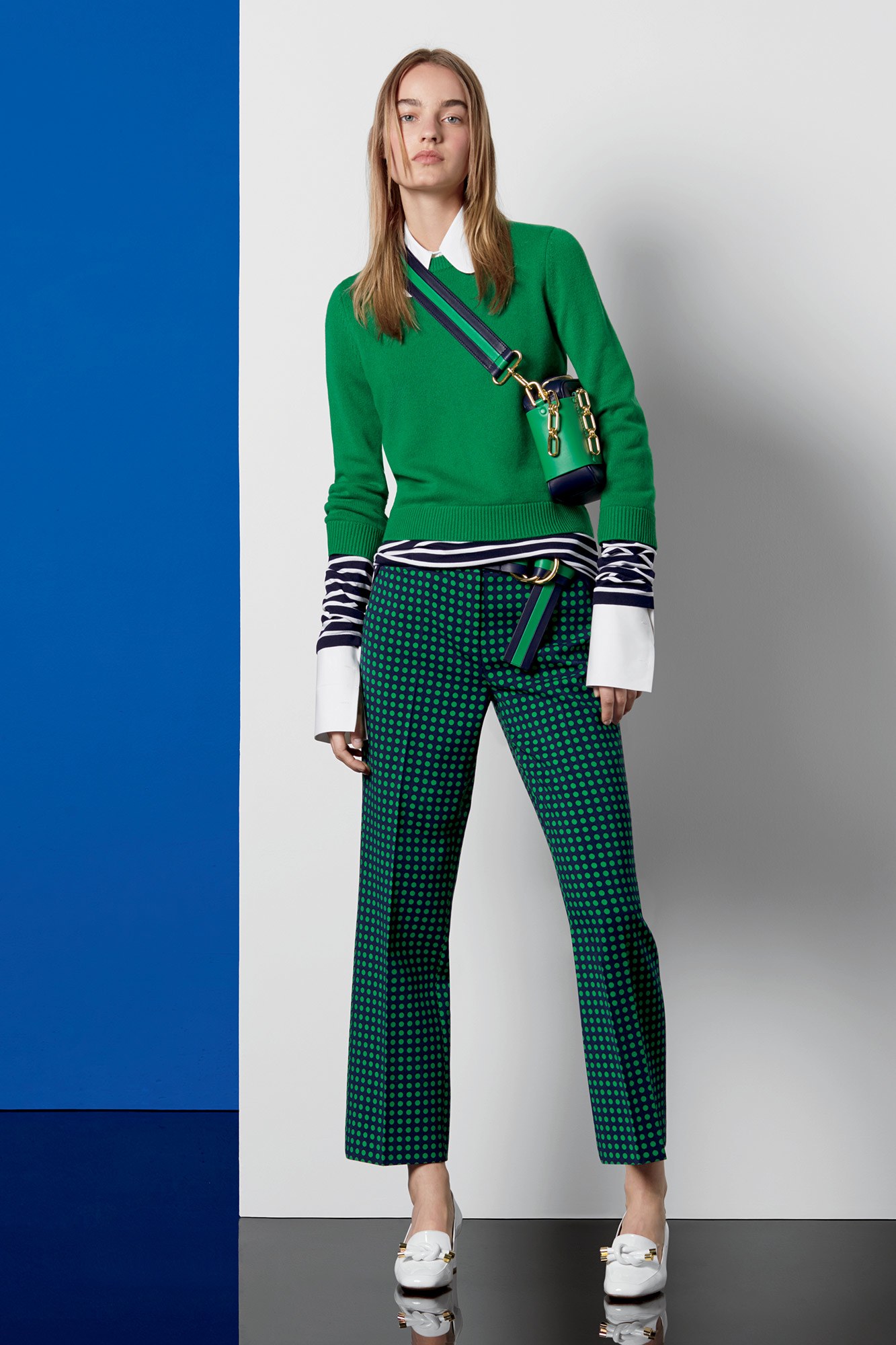
Look 22 – Michael Kors Resort 2017
To conclude: Symbolic of the outdoors and a healthy lifestyle, Pantone Greenery reminds us all of our resolution to have a healthier 2017. I hope you’ve enjoyed my guide on the colour of the year. Feel free to tag me in your favourite Pantone looks on Instagram and stand a chance to be featured!









It’s fresh, it’s vivacious and its name is Greenery! 🙂 Gorgeous blog, Tanya!
Thank you so very much, Neha!
Now that the world’s colour authority has spoken, I am ready to weigh in. 🙂 To me, this earthy hue symbolises energy and new beginnings.
Thank you for sharing, Puja.
Spring has never looked so divine! Love how you capture creativity on so many millions of levels. 🙂 This blog is perfect, as always! ❤️
Thank you very much, Faridah. I’m touched!
Just found a new favourite blog of mine here! Also, I love ‘Greenery’! But maybe I’m biased because green is one of my all-time favourite colours. 🙂
Aw ~ thank you, Nafisa! That’s kind of you.
I am obsessed with you, your photos and your writing, Tanya! You inspire me to experiment more with my blogging style! ❤️
Thank you for your sweet words, Rajani!
You put so much effort into each of your posts ~ makes it such a pleasure to read each one! 🙂 Btw, I’m a fan of colours found in nature, especially when they’re bright and vibrant!
Thank you so much for your warm appreciation, Aravind!
Stunning visualisation of the colour! Green has been my favourite colour for as long as I can remember, but I tend to gravitate more toward darker hues like emerald. 🙂
Thank you, Vamana! Glad to have your approval.
Invigorating and fresh, Greenery is the youthful, fun cousin to the colours I so often flock to! Thank you for this fantastic fashion compilation, Tanya!
I’m overjoyed to receive your compliment, Kirthi! My pleasure.
Such a fun share! I imagine Greenery will look phenomenal with the warm metallics, like bronze and copper, that we’re seeing so much of right now. 🙂
Glad you enjoyed this post, Jayanti.
I love this colour! It’s bright, cheerful and refreshing ~ particularly appealing as we enter the dreary winter months. Thank you for sharing, Tanya! xx
You’re most welcome, Chitra!
Wow! Greenery is my colour-crush of the moment because it complements all of the colours with ease! Also, I think that Greenery looks especially stunning paired with navy blue, crisp white and black! 🙂
Thank you for sharing, Sharmila.
Beautifully interpreted, Tanya! I love how Pantone uses the words ‘revive, restore and renew’ when introducing 2017’s Colour of the Year. 🙂 Heading into the new year, many of us are ready for a fresh start, and this hue encapsulates our desire for growth and new beginnings.
I couldn’t agree more, Pooja. 🙂