Pantone Colours of the Year 2016
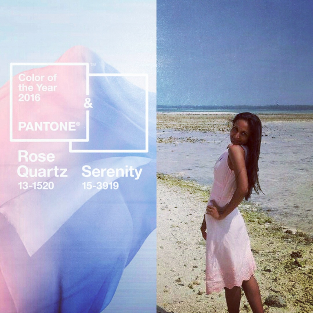
The Pantone Colours for the year 2016 are Rose Quartz & Serenity, so you can enhance your personal style with up-to-the-minute palettes. These Pantone Colours establish an intrinsic balance between a warm and soothing rose tone and the cooler tranquil blue. Both being soft colours, are symbolic of a beautiful ocean blue and Himalayan pink salt.
Seemingly the choice of these two colours was a unanimous one, which was made because they represent “a harmonious pairing of inviting shades that embody a mindset of tranquillity and inner peace,” according to Pantone.
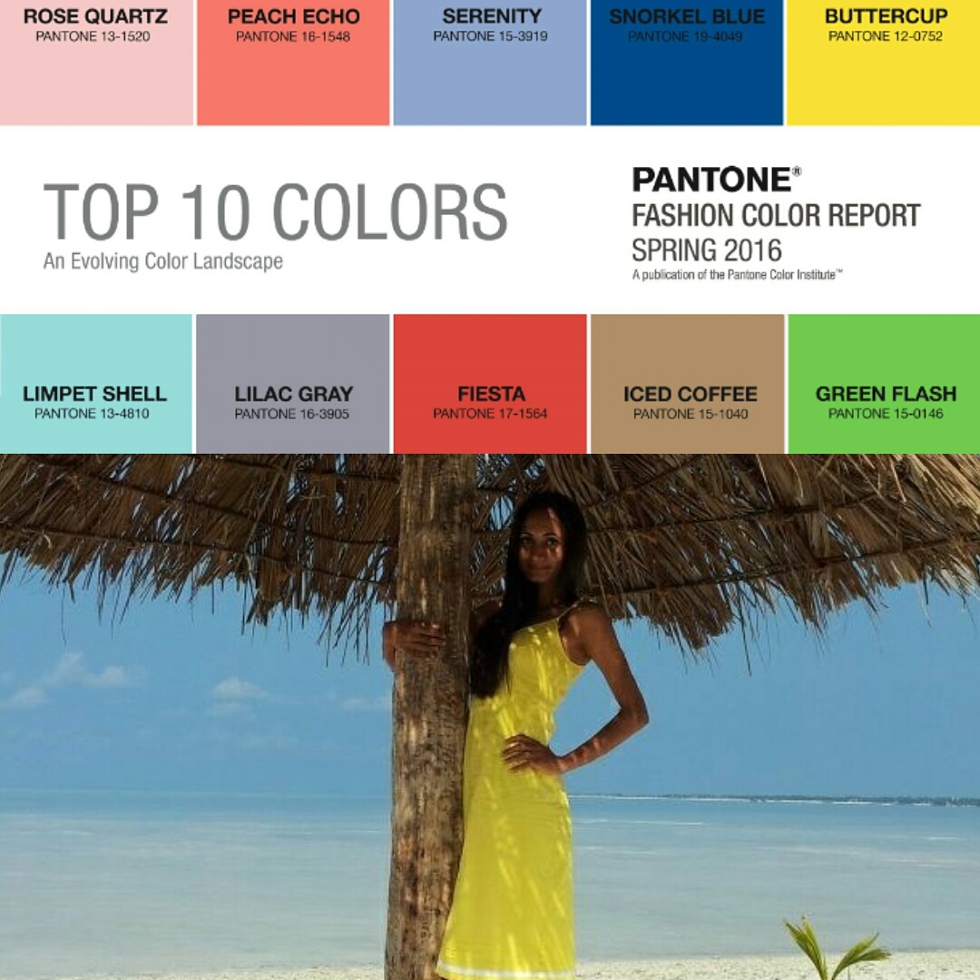
I cannot decide which one of these amazing designs and colours I am more excited about, probably ‘Buttercup’. I love a high energy colour, and this pop of yellow brings a crunchy bite to this palette.
What is your favourite of the Pantone Colours of the Year 2016? Share with me in the comments below!





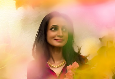
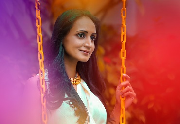
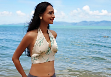
I’m a winter person, but your post actually changed my perspective a little. Both outfits are lovely! 🙂
Thank you, Soubhagya. 🙂 I’m very excited to share, too!
Love the concept and you look amazing, Tanya! Can I sign up for updates somewhere or something!? I love all your Instagram photos, too! ❤️
Thank you, Aparna. 🙂 I’ll keep you updated on that front!
Pinks make me happy, too! And, I especially love that shade of light dusty-rose at the moment! ❤️ You are everything ~ and so damn inspirational, Tanya!
I’m so flattered that you think so, Swagata!
Thank you for sharing your talent! I seriously wish I had even half of your motivation… 🙂
Have a beautiful week, and happy reading, Rahul!